What kind of Charts are available?
Discover revenue breakdowns, cost analysis, asset and liability insights, and the popular bridge & waterfall charts.
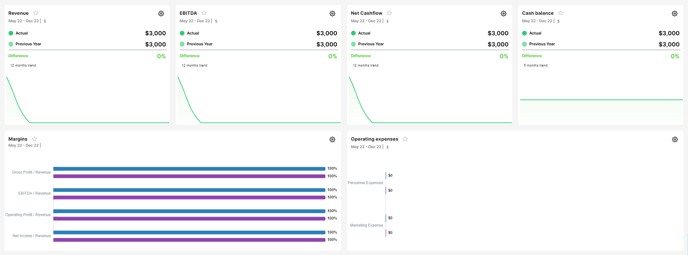
The beauty of these charts lies in their automatic generation, making them incredibly convenient for you. With just a few clicks, you can access a wealth of valuable insights.

Using the Charts section is super easy 📊 Let's break it down into simple steps:
Step 1: Select the Period
Start by choosing the period for which you want to analyze your company's performance. Here, you can select the specific year and months preferable. This sets the timeframe for the data displayed in the charts.

Step 2: Reporting Frequency
Next, select the reporting frequency—monthly, quarterly, or annually. This choice impacts charts that have months displayed on the x-axis, such as the "revenue over time" chart. It helps you zoom in on specific time intervals for deeper analysis.

Step 3: Comparison Periods
Now, pick two comparison periods to compare performance. Here you can choose from the 4 comparison periods: Actuals; Forecast; Previous Year and Previous Year. By selecting the desired periods, you are able to view charts with results for the selected period. This allows you to easily identify trends and variances.

Step 4: Unit Display Format
Choose how you want the numbers to be displayed - full numbers, thousands, or millions. This ensures clarity and helps you grasp the scale of your business's financial figures.

This section has around 50 pre-defined charts that provide you with a crystal-clear picture of your business's performance.
🌟 Pay special attention to the waterfall charts!
Loved by investors and professionals, these charts help you understand the reasons behind differences in your actual results compared to your plan or previous periods ✔️

If you want to focus on specific charts, you can create Custom Dashboards tailored to your preferences 🍀🙌
❣️ For a visual walkthrough of how to use the Charts section, don't forget to watch our informative video tutorial.
Related Articles
How to create Custom Dashboards?
Streamline your financial reporting by creating personalized dashboards for charts that matter most to you. With the Custom Dashboards, you have the power to add only the charts that you want to regularly monitor, creating a customized summary ...How to select Single Indicators in Modeliks?
Indicators serve as measurable metrics that offer insights into various aspects of a business's financial performance. In Modeliks, under the Dashboards module, you can easily access the "Single Indicators" section, which contains all the relevant ...How does the Actuals section work in Dashboards?
In Modeliks Dashboards, the section called Actuals allows you to input the financial results of your business. Actual financial results are the real financial results of your business for the previous months and years, as recorded in your accounting ...